Proteomics and metabolomics are two pivotal fields in the study of biological systems. Proteomics is concerned with the large-scale study of proteins, particularly their functions, structures, and interactions. Meanwhile, metabolomics focuses on the study of small molecule metabolites that reflect the biochemical state of a cell or organism. These fields provide critical insights into cellular processes, disease mechanisms, and therapeutic targets.
Venn diagrams help visualize the intersection and unique aspects of proteomics and metabolomics data, providing a clear representation of shared biomarkers, pathways, and processes in biological systems.
The Structure of a Venn Diagram in Scientific Research
A Venn diagram is a widely used visual tool that illustrates the relationships between different sets of data. In the context of scientific research, it serves as an intuitive and effective means of representing how different variables, datasets, or groups of data points relate to one another. The structure of a Venn diagram typically consists of overlapping circles, each representing a specific set of data. These sets are often based on different experimental conditions, variables, or characteristics that researchers wish to compare or contrast. The overlapping areas in the diagram indicate the common elements shared between those sets, while the non-overlapping areas represent the unique elements specific to each set.
Basic Design and Functionality
The basic structure of a Venn diagram is simple yet powerful. Each circle corresponds to a distinct data set or group. These circles can be two or more in number, depending on the complexity of the data being analyzed. For example, in a two-set Venn diagram, the diagram consists of two circles that overlap in the center. The area of overlap signifies the data points that are shared between the two sets, while the areas outside of the overlap indicate the elements that are unique to each set.
When analyzing proteomics and metabolomics data, the sets might represent proteins identified through proteomic analysis and metabolites measured in a metabolomic study. By placing these sets into a Venn diagram, researchers can clearly visualize the commonalities between the two data sets (such as overlapping biomarkers) and the distinct proteins or metabolites unique to each. This visual simplification helps researchers quickly identify key overlaps and gaps in the data, facilitating deeper analysis.
Complexity in Multi-Set Venn Diagrams
While two-set Venn diagrams are the most common, more complex diagrams involving three or more sets can also be created. These diagrams allow for the simultaneous comparison of multiple datasets, providing a more comprehensive view of how different data points interrelate. For example, in multi-omics research, scientists may wish to analyze the intersections between proteomics, metabolomics, and genomics. In this case, a Venn diagram could include three circles, each representing one of the omics datasets, and the overlapping regions would show the common data points between the different datasets. This helps to identify areas where proteins, metabolites, and genes may influence one another or share common pathways, offering rich insights into complex biological systems.
The utility of multi-set Venn diagrams becomes especially evident in fields like systems biology or personalized medicine, where researchers are looking for holistic views of how multiple molecular data types are interconnected.
The Structure of a Venn Diagram in Proteomics and Metabolomics Research
In the specific context of proteomics and metabolomics, the structure of a Venn diagram becomes even more crucial, as these fields deal with vast and complex datasets that require clear, visual representation. Proteomics involves the study of proteins, including their functions, expressions, and interactions, while metabolomics involves the identification and quantification of small molecules (metabolites) present in a biological sample. By using Venn diagrams, researchers can capture how proteins and metabolites are related, especially in the context of cellular functions, disease states, and metabolic pathways.
Adapting Venn Diagrams for Omics Data
Proteomic and metabolomic data are often generated through technologies such as mass spectrometry (MS) for proteomics and nuclear magnetic resonance (NMR) or MS for metabolomics. These high-throughput techniques provide complex data sets with thousands of variables, making it essential to use tools like Venn diagrams to manage the complexity.
In a typical Venn diagram for proteomics and metabolomics, each circle represents one of the two fields. For example, one circle would represent the proteins identified through proteomic analysis, and the other would represent the metabolites detected in metabolomic analysis. The intersection of the two circles would highlight shared elements, such as proteins and metabolites that are involved in common biological processes or pathways. The areas outside of the intersection would represent unique features in each field, such as proteins that are not associated with the detected metabolites or metabolites that are not linked to any proteins in the dataset.
The Venn diagram serves as a powerful way to visualize how the protein expressions and metabolic profiles overlap. In proteomics, proteins may act as enzymes or receptors involved in metabolic pathways. In metabolomics, metabolites reflect the end products of these pathways. By using Venn diagrams to illustrate their overlap, researchers can gain insights into which proteins influence metabolic changes and how these processes are connected.
Interpreting Shared and Unique Data Points
One of the key advantages of using Venn diagrams in proteomics and metabolomics is their ability to identify overlapping data points, which can uncover potential biomarkers, metabolic pathways, or biological mechanisms shared by both fields. For example, an overlap between specific proteins and metabolites in a disease state may indicate their involvement in a critical metabolic pathway or regulatory network central to the disease.
Conversely, the distinct sections of the Venn diagram reveal unique insights from each dataset. In metabolomics, for instance, researchers may discover metabolites influenced by enzymes from proteins not captured in proteomic analysis. Similarly, proteomics may highlight proteins engaged in biological processes that don't directly affect metabolite levels, providing a different layer of understanding about cellular functions.
By visualizing both commonalities and differences, Venn diagrams offer a comprehensive view of how proteomics and metabolomics intersect and complement one another, driving focused biological investigations.
Practical Examples in Disease Research
Venn diagrams in disease research, like cancer, reveal how metabolic changes and protein expressions intersect, highlighting key biomarkers and metabolic pathways involved in disease progression. This visualization allows researchers to easily identify overlapping biomarkers or pathways between proteomics and metabolomics, while also revealing distinct data points unique to each field.
This visual distinction is invaluable for guiding further research, such as validating the potential of a shared biomarker as a diagnostic tool or exploring how the unique proteins or metabolites could serve as therapeutic targets.
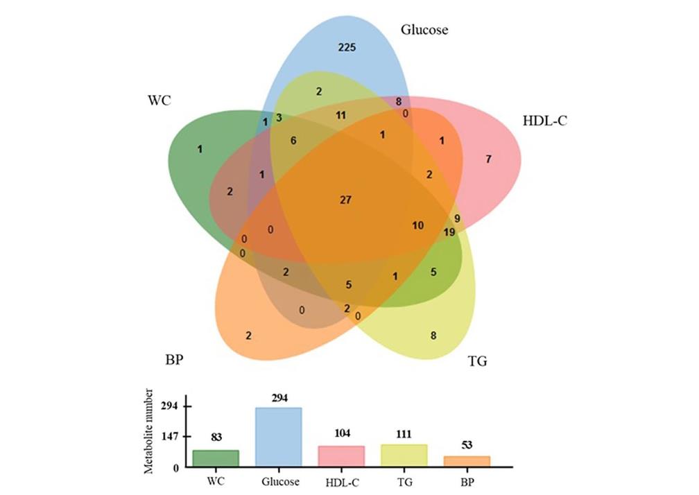
Venn diagram showing the number of metabolites significantly correlated with MetS components, together with respective histogram representing the number of significant metabolites for each clinical MetS components (Monnerie, Stéphanie, et al., 2020).
Limitations and Considerations
Limited Scalability with Multiple Data Sets
As the number of datasets or conditions being compared increases, Venn diagrams can become overly complex and difficult to interpret. A standard two- or three-set Venn diagram is effective for representing the intersections between a manageable number of datasets. However, once you expand to four or more sets, the diagram's readability and clarity are significantly diminished. This is especially true in multi-omics studies, where the number of variables can be large.
For example, trying to compare gene expression, protein abundance, and metabolite concentrations across multiple conditions can result in a diagram with too many overlapping regions, which may lead to confusion rather than providing clarity. In such cases, alternative visualization tools, such as heatmaps, network graphs, or principal component analysis (PCA), may be more effective in conveying the complexity of the data.
Oversimplification of Complex Relationships
Venn diagrams, by their nature, simplify data relationships into basic intersections and unions. While this can be helpful in providing an overview of shared and unique elements, it may not fully capture the intricate nuances and multi-dimensionality inherent in omics data. For example, interactions between proteins and metabolites may not be adequately represented in a Venn diagram, as the relationship may involve complex biochemical pathways or regulatory networks that go beyond simple overlap.
Additionally, Venn diagrams do not account for the degree of overlap between datasets. For instance, two proteins may be shared between two datasets, but the degree of their involvement or relevance to the research question might differ significantly. Venn diagrams do not inherently provide insight into the strength or significance of these relationships.
Loss of Quantitative Information
Venn diagrams are primarily qualitative tools, meaning they show the presence or absence of overlapping data points but do not provide quantitative information about the magnitude of the overlap or the individual contribution of each dataset. In proteomics and metabolomics studies, where the abundance of proteins or metabolites is often key to understanding biological processes, relying solely on a Venn diagram can be insufficient. For example, a Venn diagram might show that certain metabolites and proteins overlap, but it won't indicate whether their expression levels are high, low, or statistically significant across different conditions or samples.
To address this, researchers may need to supplement Venn diagrams with quantitative measures, such as fold changes, p-values, or other statistical analyses, to provide more context to the visualized data.
Difficulty in Representing Hierarchical or Pathway Information
Omics research often involves hierarchical relationships, such as the regulation of gene expression by transcription factors or the metabolic flow between different stages of a biochemical pathway. Venn diagrams are not well-equipped to represent these hierarchical or pathway-based interactions. While they show which sets overlap, they do not indicate the directionality or biological context of these relationships.
In cases where pathway-level insights are critical, other visualization techniques like pathway maps, circos plots, or network diagrams might be more appropriate. These alternatives can show the flow of metabolites, interactions between proteins, or the regulation of specific genes in a way that Venn diagrams cannot capture.
Ambiguity in Large-Scale Datasets
In large-scale omics studies, such as those involving big data or population-wide datasets, Venn diagrams can become less effective due to the sheer volume of information. The overlap between multiple datasets may represent only a small fraction of the total data, making it difficult to draw meaningful conclusions from a visual representation. The sheer number of variables can also lead to false positives or false negatives in the overlap, as minor differences in data processing or annotation can drastically change which data points are considered shared.
In these cases, statistical approaches that account for the multiple testing problem and adjust for false discovery rates may be necessary to identify meaningful overlaps. Computational methods, such as machine learning algorithms or cluster analysis, can help filter and prioritize the most relevant data points for visualization.
Potential for Misleading Conclusions
Venn diagrams, like any visualization tool, are subject to interpretation bias. Researchers may inadvertently overemphasize the significance of overlapping regions or underappreciate the importance of unique data points that fall outside the diagram's intersections. For instance, a researcher might focus on shared proteins between proteomic and metabolomic datasets without fully exploring the broader biological context in which these proteins operate, potentially leading to confirmation bias or overlooking other critical variables.
In order to avoid such pitfalls, it's essential for researchers to exercise caution when interpreting Venn diagrams and to use them in conjunction with other analytical techniques, such as statistical tests, pathway analysis, or system biology modeling.
Reference
Monnerie, Stéphanie, et al. "Metabolomic and lipidomic signatures of metabolic syndrome and its physiological components in adults: a systematic review." Scientific Reports 10.1 (2020): 669.